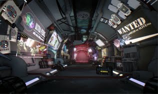
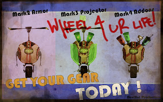
"There is a planet of robots. They kill each other for fun!"
The History of BOTs
By Peter Richmond and Kuo Yu Lu
The concept of BOTs came from the following notes, developed during Junior year Preproduction.
TASK: create a 2D animatic pitch for the Senior year 2minute thesis 3D trailer.
-Needs to be easy to Animate!
-Can't be organic due to animation needs..
-Shouldn't be too realistic either.
-Needs to have an impressionable art style (ex. Borderlands.)
-Aimed for casual players!
-Geared for Massive Multiplayer Online gameplay.
-Catered for Role Playing Audiences.
-Character design: No legs, No faces. SIMPLE SIMPLE SIMPLE!
-Strong emphasis on player customization (ex. Little Big Planet, World of Warcraft.)
The main notes that helped us design our world were:
-Can't have legs: by using a simple wheel instead of bipedal legs, we greatly reduced our risks with realistic animations.
-Can't have faces: by using a simple screen to represent the robots 'faces' meant we didn't have to spend time
with face rigging and animation.
-Can't be realistic: by making it obvious right away that the goal wasn't photorealism, we had a lot more room
for creativity with our environments.
-Aimed for casual players: "Go in, have fun, leave."
KEY IDEAS
The world of “B.O.T.s” is about becoming famous, being awesome and proving you are the best fighter! Players will assume the role of a robot whose purpose is to fight with all the other robots for the ultimate position as King of the Arena. The King of the Arena is promised all the Fame, Money, and Power in the world!
After some research and sketches, we came up with our original character design that solidified our idea to create a world of robot mayhem.
BOTs - Generation 1
This original bot design had already met most of our requirements. We liked it, so we decided to move it to the next stage.
BOTs - Generation 2
We began to push the color and style of the characters and world. In this iteration, the concept of "Addons" to the characters became a clear mechanic for us. This could allow players to add physical perks and abilities to themselves. (In this design the character is missing arms, and actually had pupils.) The concept of the "Minibot" was also introduced as a player companion that could be just as customizable.
BOTs - Generation 3
With the base structure, we started to explore the "fun" side of the characters with different accessories and ways the players could make their robots be a representation of themselves. The idea of the "holographic Projection" as a believable way to display text or icons above the robots.
BOTs - Generation 4
Our biggest breakthrough, this allowed us to really see how simple out character was. This helped us quickly generate storyboards, poses, action shots, concept art, and more.
Some initial Sketches:
Story and the World:
Now that we had out characters, we needed to generate a world for them. The gameplay was always clear to us. Essentially we had BOTs fighting each other, getting new weapons and gear, and basically being as awesome and popular as possible and achieve ultimate fame and glory. We didn't want viewer to focus heavily on the history and lore of the world, but concentrate on the "fun" part of the game. After much brainstorming, our final story for the entire world of bots was : There is a planet of robots, they kill each other for fun!
With that out of the way, we had the freedom to do whatever we liked! It allowed viewers to not question the feasibility or the believability since it was such an accepted concept. We were trying to pitch an idea that could be easily and quickly understood by anyone, so the simpler the better. Here is the main information about our world:
Where: A Robot planet, in an "underworld" city called Dabot City
When: A long long time ago.
Who: a bot among trillions.
What: Fight other bots, get geared, become famous!
Audience: Casual Adult MMO
REFERENCE:
Mall / Airport Foor Court (Photograph)
Very Dense City (painting: Tekkonkinkreet)
Extravagant Carnival (painting: Tekkonkinkreet)
Commercial Signage (3D, ilya Nedyal)
Large City (Final Fantasy, WallE, Robots, Ratchet and Clank)
Color Palette:
Art Style:
The goal for the art style was to bring together the intense colors of World of Warcraft, the lighting from Bioshock, the grungy hand-drawn style of Borderlands, and the partially destroyed but rebuilding world similar to Fallout 3. The game would essentially play like most of these games with an emphasis on the exaggerated gameplay of Team Fortress 2
Art Style Test:
INITIAL ANIMATIC:
The original idea was about a news reporter giving a tour of Dabot City, walking the viewer through all the goodies that the game had to offer. In the animatic we showed off the News Channel, the Leaderboard, Customize Shops, Weapons District, Champs Wall of Legends, and the Arena.
Animatic Pass 3: Passed for Production!
Reporter Talking over the City Map
Reporter in front of the Weapons Board
Reporter in front of the Wall of Legends
INITIAL BLOCKOUT
After the idea was approved, we went straight into modeling and blocked out DaBot City.
City Blockout: LeaderBoard
City Blockout: Custom Shops
City Blockout: Weapon Board
INITIAL CHARACTER
While designing the city, we had to know who we were designing the city for! We also started work on teh characters right away as well as their gadgets. Our plan was to have one core base model bot and just add things on to it to make it into different bots. The base model was very simple:
With this design, we started brainstorming what types of weapons and gear would fit our style. During this time period we were heavily influenced by the World of Warcraft art style and design of their low poly models. We also took inspiration from Little Big Planet and Oblivion.
We started to re-use a lot of our pieces by combining them in different ways, or applying different textures to them. We realized we could make our entire world as well as all of our characters and props and gadgets from a short list of interchangeable pieces. These few pieces made in Maya could be manipulated to create many more unique pieces within the UDK engine.
NEW ANIMATIC!
After spending some time modeling and blocking out our city, we took a look back to our original animatic and decided we could improve it. How could we make it better? We needed to make it feel more like a game trailer and less like an in-game cinematic. How could we make it more exciting and have more gamer appeal? the answer to these question was to start over with a totally new animatic.
No More News!
We didn't think the original pitch felt like the game we wanted at all. We weren't showing off a lot of the gameplay features we wanted to express. This time we concentrated on the style of the gameplay of the game, trying to make the trailer feel like you weren't watching, but actually playing. This time we started with a list of exactly what we wanted to show.
-Robots killing robots
-Customization
-Obey the Mayor
-RPG + Shooter
-Level up your Gear and Skills
-MMO
-Co-op / game modes
-Weapons!
-ACTION!
With these points in mind, we started to design shot by shot to communicate exactly what we wanted. We decided any form of story other than the hints of the mayor would raise unnecessary questions. A sort of linear montage of game features was the final decision.
-Introduction: Minibot POV searching over signs.
-Hears sound of gun loading, senses danger!
-BANG! minibot dies! zoom in on the bots who shot him.
-Introduce heroes
-Zoom in on Welcome to Dabot City
-Interrupted by the Mayors Broadcast
-Team Collision Presents
-Quotes
-Arena Face Smash
-Character classes / leveling / achievements
-Customize
-Action: black market seller getting chased by cops!
-Gang / guild warfare
-Boss's Lair / DLC
-Co-op / Zombies
-Credits
-Pong bots
Some of the mid-year WIP shots:
Some scene progression approx 80%
Textures and Materials:
One of our most used material was the holographic poster. We created a standard set-up for this material so we could just swap out the poster and make quite adjustments to its static effects, refresh rate, saturation, color and even its movement.
Animation:
We animated everything in engine. Animation was one of the biggest problems because we had been assigned a 2 minute trailer without any animation training. Our shots were designed to have as little animation as possible while still having a sense of lots of players and intense action.
Atmosphere:
Texture Only
Lighting Only
Together
Since we had many emissive objects and signs, we tried to keep the environment as dark as possible to create a contrast and points of interest. Many lighting references are from Bioshock and others from New Vegas.
Final Touch
After we finished all the video footage from the game engine, it was time to add some graphic effects. These are screenshots from the engine, painted over in Photoshop and animated in Premiere.
After we finished with the editing and submitted the video, we created a website to promote the thesis and the world of BOTs. To view the final trailer please visit www.dabotcity.com today!
BOTs
By Peter Richmond and Kuo Yu Lu
This project was created at Ringling College of Art and Design by two people. We worked closely as a team in a 50/50 effort to complete this project, and we were both very dedicated in each area of the pipeline.
All Work Shared by Both:
Concept Art, Modeling, Texturing, Materials, Level Design, Poster/Graphic Design
Peter Richmond - Editing, Animation, Cinematics
Kuo Yu Lu - Particles, Lighting, Post Process
All work property of Peter Richmond and Kuo Yu Lu 2011


